Android Central Verdict
Android 13 doesn't introduce as many features as the last two releases. Still, it comes with a few tweaks to the Material You design language, changes to the notification shade, much-needed privacy additions, and new accessibility features. What it lacks in flair, it makes up for in stability, and that's just fine in my book.
Pros
- +
Material You is more customizable
- +
Much-needed changes to notification management
- +
Better accessibility features
- +
Useful privacy additions like granular file control
Cons
- -
Not as many marquee features as previous years
- -
A few features aren't quite usable at launch
Why you can trust Android Central Our expert reviewers spend hours testing and comparing products and services so you can choose the best for you. Find out more about how we test.
Whenever I sit down to write one of these reviews, I'm reminded that Android is an everchanging OS and that Google continually makes tweaks and changes to fix security vulnerabilities or roll out features over the course of the year. With Google Play Services and the underlying framework, Google has the ability to easily roll out updates to billions of phones.
That said, Google reserves its biggest changes for its annual Android release. The last two years have been busy for Google on this front; Android 11 introduced a new notification management system that prioritized conversations, and Android 12 saw a radical UI overhaul in the form of Material You and a slew of privacy-focused features.
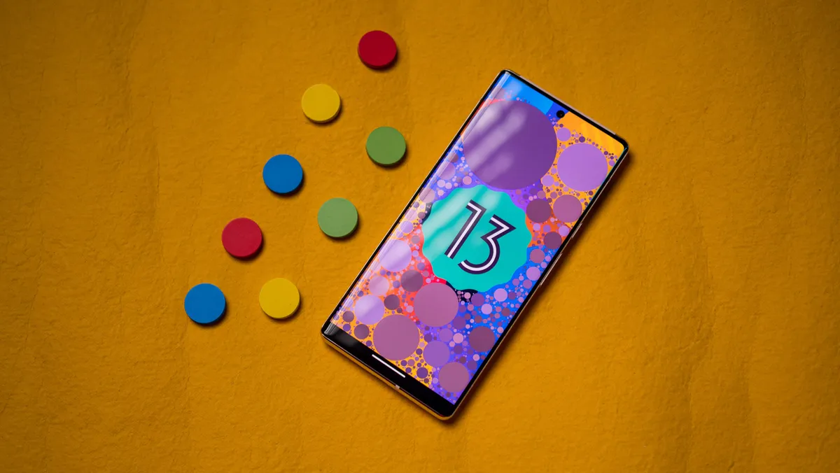
Therefore, it isn't astonishing that Google chose to play it safe this year, and while Android 13 doesn't have much in the way of new features, it delivers refinements in other areas. These include much-needed security fixes, tweaks to Material You, and subtle changes to the notification shade. So let's dive in and take a look at all the changes in Android 13 and when you'll be able to use the OS on your phone.
Material You gets added refinement
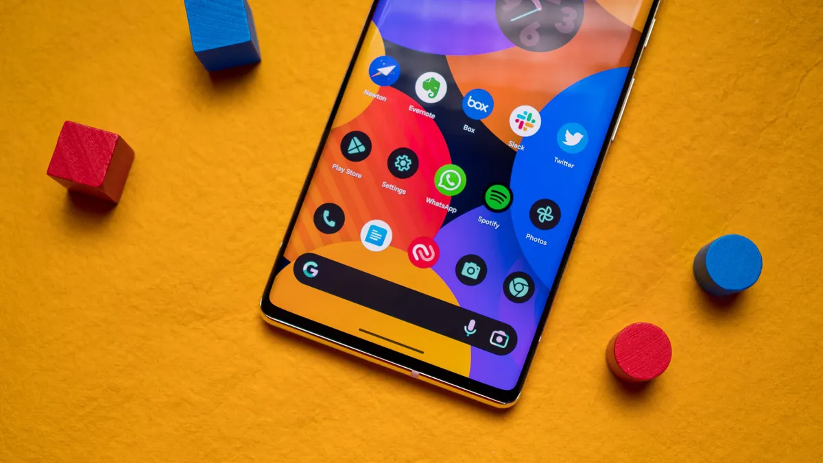
With bright colors and aggressive styling, the Material You design aesthetic is much more flamboyant than Material Design. While the interface has its detractors, I like the changes Google introduced — Material You makes Android fresh and enjoyable. After using the Pixel 6 Pro for over two months this year, I can confidently say that this is the direction Google needed to take.
Of course, that's the case if you're using a Pixel or a few other phones that run a clean interface without any customization. These days, that list includes ASUS, Motorola, Nokia, and Nothing. For all other devices, Material You is limited to the dynamic color picker that lets you change accent colors system-wide.

Google isn't making many noticeable changes to Material You with Android 13, with the biggest addition being more color palettes to the dynamic color picker. The feature basically creates a list of color palettes that are based on your phone's current background, and it is an easy way to freshen up the look of the interface.
With Android 13, you can choose between 16 color palettes instead of four, and that's great to see. You still don't have the ability to choose your own colors, and that's a feature I want Google to add down the line — ColorOS 13 already has it. If you don't like any of these auto-generated colors, you can always pick basic accent colors.
In a similar vein, themed icons now work with third-party apps, but compatibility is still hit-and-miss. It is meant to switch app icons to monochromatic color palettes that are in line with the system-wide accent colors, and while it looks well enough with Google services, I couldn't get it to work with third-party apps, and the dueling design feels off-putting.
Notification pane gets a large media player

This wouldn't be an Android release without Google making some changes to the notification pane, and thankfully, the tweaks are minimal. The notification pane still features the large rectangular tiles that debuted last year, and the persistent media player's new design prominently highlights album art. The feature set itself hasn't changed much; you can access playback controls and cast music to another device.
In Android 12, the media player had a narrow layout that gave you easy access to playback controls, and you could then switch to the full-width interface with a second pull-down gesture. This isn't the case in Android 13; by default, the media player uses the full-width tile, which means less space for notifications.
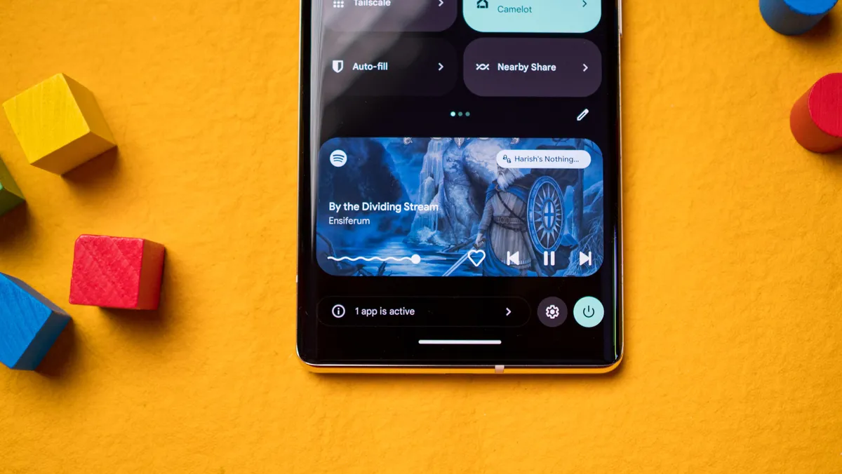
The new layout is fine, but I would have liked the ability to choose a width for the media player. Another change has to do with the seek bar; it now wiggles when music is playing, and I don't know why — I guess Google thought it would be a quirky way to show song progress.
Other than the media player, the only other change on the notification pane is a task manager that sits at the bottom of the pane. It highlights currently active apps in the foreground, and it is a nifty addition.
App notifications are now opt-in
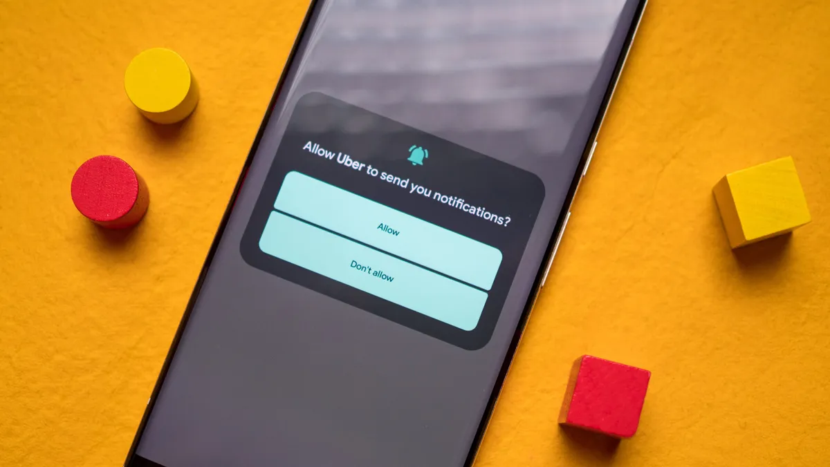
This is a feature that I particularly like; with Android 13, app notifications are opt-in by default, and you will have to give permission before they can send a notification. This has been a mainstay on iOS for a long time now, and I'm excited that it is now available on Android. I use a lot of services that think it is okay to send errant notifications that don't provide any useful information, and this is a great way to deal with that problem.
Also, this is a better solution than what was available in Android 12, where you had to wait for a notification, then long-press it to go into an app's settings, and manually adjust notification settings. On that note, if you're upgrading from Android 12, your notification preferences are carried over, and the feature goes into effect for any new app you install and not the ones that you already have.
Change language for individual apps

Google is making a big push for accessibility by rolling out the ability to change language for an app. So instead of changing the system language, you can just select the language for an individual app.
This is particularly handy if you're multilingual, and one of the best additions in Android 13. However, there are issues in usage; you can't change the language for any app, it has to show up in the language selection window. And right now, there are far too few services that take advantage of this feature.
That will likely change in the coming months, but for now, the feature is limited in its usability.
More control over media permissions
Google is making changes to how media permissions work in Android 13. First up is a new photo and video picker that prevents apps from accessing your entire media library. Instead, when you launch the system photo picker when you're in an app like WhatsApp or Instagram, it will only be able to access the photos you select; like opt-in notifications, this feature has been in iOS for a while, and it's great to see debuting on Android.
The best part is that it isn't limited to Android 13, with Google rolling out the feature to devices on Android 12 as well. The only issue at the moment is that none of the apps that I use implement this feature, and Google doesn't mandate its use, and I would like to see that change over the coming months.
Other changes to media permissions include granular file access; instead of bundling images, audio files, and videos as media, they're now split into their own categories, so if an app needs access to images and videos, it will need to ask permission for both separately. So if you're using an audio player like USB Audio Player Pro, you can just give it access to audio files, and it won't be able to access images or videos.
Search on the Pixel Launcher is confusing again

The Pixel Launcher isn't getting any visual changes, but Google is trying to unify the search experience between the home screen and the app drawer. When you access the search bar on the home screen, you'll see suggested apps and your Google Search queries, and searching for an app like Spotify will pull up the app and also associated web results. If you were looking for a Spotify playlist, then you'll need to scroll down to the bottom of the page, where you'll find a From this device sub-menu that lists on-device listings.

Now, when you perform the same query in the search bar housed at the top of the app drawer, you'll still get a few web results, but they're limited to four listings, and it's easier to find on-device content.
This is just bound to create added confusion to users, and I don't like the change; Android 12 had a distinctly better system that limited the search bar within the app drawer for on-device content and the one on the home screen for web listings. You can go back to this format by heading into the search preferences (selecting the overview menu that shows up within the search bar) and turning off the Search the web setting.
All the other additions

There are a host of smaller tweaks that Google rolled out in Android 13, and a few that will be ready for next year's release. Here's what's new:
- There's now a native QR code scanner that can be set up as a tile in the notification shade. This way is faster than going through Google Lens, and it's great to see Google making the feature easily accessible.
- Split-screen multitasking continues to be limited on Pixel phones, with Google curbing the feature once again. When you pull up the split-screen mode within the Recents menu, you'll only be able to use an app that's already running — there's no option to choose all apps on your phone. Other brands do a much better job at this, with One UI and ColorOS offering a much more seamless path to split-screen multitasking.
- You'll find a new visual clipboard editor that makes it easier to edit the text that you've just copied. The contents of the clipboard clear after an hour.
- Google made the gesture navigation bar that sits at the bottom of the screen a little bigger and wider, and there still isn't a way to hide it or switch to a transparent setting. Other interfaces like ColorOS and MIUI offer the option to hide the nav bar, but that is missing in the Pixel Launcher.
- Google is working on a predictive back gesture that shrinks the screen to the right, letting you get a preview of the screen you'll go back to. If you don't want to go back to that screen, you can just lift your finger to stay on the current window, and this is a very useful addition. While we're not getting the feature in Android 13, Google will make it standard in Android 14.
Android 13: When will you be able to use it?
As is always the case with a new Android release, the question is how soon you can get it on your device. The stable Android 13 update is currently available for Pixel phones, starting with the Pixel 4 series, and you'll have to wait a little while for the build to make its way to the best Android phones.
Most manufacturers are doing a better job delivering the stable update. Samsung is already onto the third One UI 5 beta build, the stable ColorOS 13 build is available for the Find X5 Pro, and OxygenOS 13 also hit the stable channel.
Xiaomi is working on the MIUI 13 beta with a stable update scheduled for the end of 2022. If you use a device with a vanilla Android interface — ASUS, Motorola, Nokia, and Nothing — you're in for a lengthy wait. That said, most brands are rolling out the stable update faster than previous years, and that's an achievement in and of itself.
On the whole, Android 13 doesn't have a whole lot to offer, but that doesn't make it a boring release — far from it. Google polished a lot of features that were introduced last year and rolled out useful changes that make a big difference in daily use — like opt-in notifications — and much-needed privacy fixes. It may not have the flamboyance of Android 12, but it is much more stable in daily use, making it all the more enticing.